Low Vision: Contrasting Colors
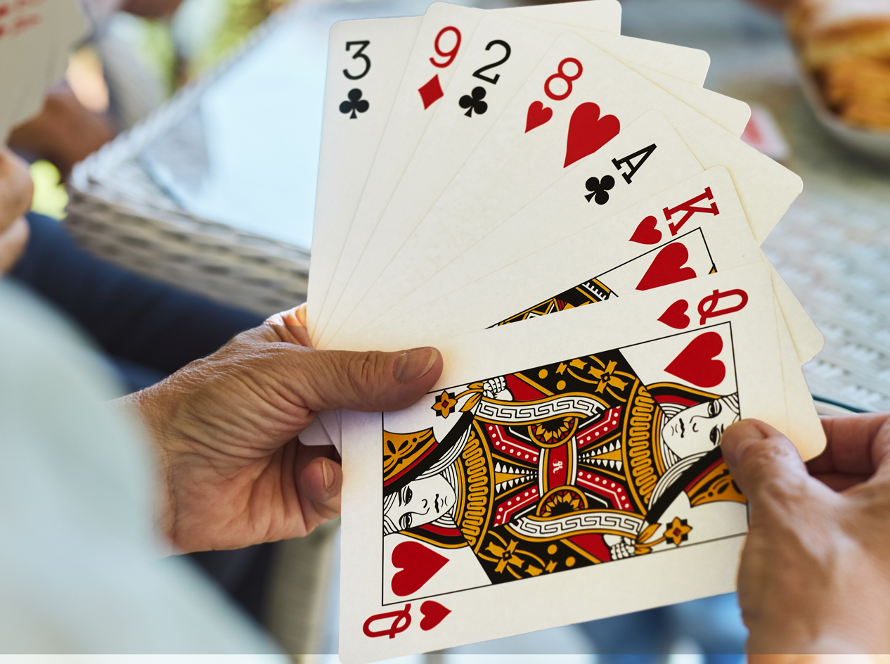
For those of us with low vision, some colors work well and make things easier to see. And others, not so much. It all comes down to contrast. In short, highly contrasting colors can make things easier to see. And the brighter, more intense, the light, the better the contrast in colors. That's why it's important to avoid shadows and dim lighting. And some colors can be easier to see than others. Bright reds, oranges, and yellows, for instance, are easier to see them pastels and dull colors, like beige.
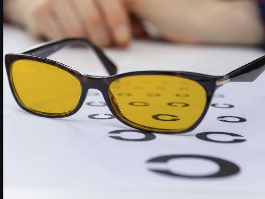
Wearing yellow or amber sunglasses can increase the color contrast. They also help reduce eye strain and fatigue. You may want to give them a try. Contrast can play a role in how well you see items inside your home. Think about how much easier outlets and switches would be to see if there are dark colored outlet plates and switches on light colored walls
Now that you've had a chance to learn a bit with us, we'd like to learn more about you. Your email address, name, how you heard about Hadley, and your relationship to vision loss. Learning more will give us a better understanding of how to personalize Hadley just for you. And don't worry, everything you share with us online will be kept safe and secure. Of course, if you'd prefer to talk through these questions, we are just a phone call away at 800-323-4238.
Taking these few steps saves your preferences so you can continue right where you left off and track your progress every time you log on. Plus it connects you to the Hadley community and helps sustain our funding to keep Hadley free-of-charge. And last but not least, it gives you direct access to the Hadley team. So now is your chance to sign up and join us.
Explore
- Workshop

- Workshop

-
Recreation Chat
Discussion
-
"I get out there and I still do what I can"
Audio Podcast
- Explore more