Windows Low Vision: High Contrast
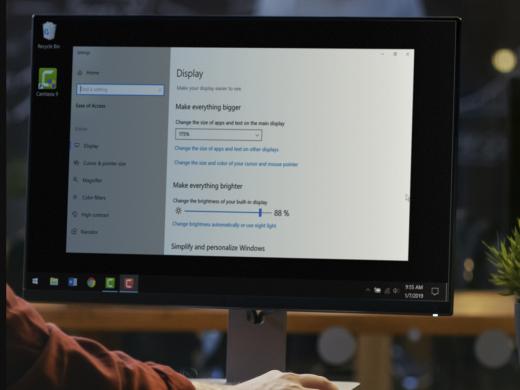
I'm Vikki Vaughan and today we'll talk about Windows high contrast options. Do you have a hard time seeing the difference between items on your computer screen? Do you find websites visually confusing? For many people with low vision, contrast issues can make looking at the computer challenging. Contrast is based on differences in color and brightness. Colors that look very different, for example, red, blue, and green, can have similar brightness and not provide enough contrast. Some websites use poor design elements, such as bad color combinations. The lack of contrast makes it hard to tell various elements apart. Legibility, or how clear the print, is and optimal color combinations differ among individuals. They can even vary for the same person, depending on conditions such as lighting and fatigue.
Now that you've had a chance to learn a bit with us, we'd like to learn more about you. Your email address, name, how you heard about Hadley, and your relationship to vision loss. Learning more will give us a better understanding of how to personalize Hadley just for you. And don't worry, everything you share with us online will be kept safe and secure. Of course, if you'd prefer to talk through these questions, we are just a phone call away at 800-323-4238.
Taking these few steps saves your preferences so you can continue right where you left off and track your progress every time you log on. Plus it connects you to the Hadley community and helps sustain our funding to keep Hadley free-of-charge. And last but not least, it gives you direct access to the Hadley team. So now is your chance to sign up and join us.
Explore
- Workshop

-
Tech It Out
Discussion
-
Vision Loss and Depression
Audio Podcast
- Explore more
