
Windows Low Vision: High Contrast
I'm Vikki Vaughan and today we'll talk about Windows high contrast options. Do you have a hard time seeing the difference between items on your computer screen? Do you find websites visually confusing? For many people with low vision, contrast issues can make looking at the computer challenging. Contrast is based on differences in color and brightness. Colors that look very different, for example, red, blue, and green, can have similar brightness and not provide enough contrast. Some websites use poor design elements, such as bad color combinations. The lack of contrast makes it hard to tell various elements apart. Legibility, or how clear the print, is and optimal color combinations differ among individuals. They can even vary for the same person, depending on conditions such as lighting and fatigue. Thankfully, Microsoft has built in options that let us customize our contrast settings so they work for us.
We find those options in the ease of access settings. Let's open ease of access to check them out. We'll use the keyboard shortcut of Windows and the letter U to activate the ease of access tab. We do that by holding down the Windows key and then we tap and release the letter U. A handy tip, think of the word usable. Since the options we're talking about make our computer more usable, this helps us remember our shortcut.
On the left side of our screen under settings, we find a list of customizing tools. We see our first category is specific to vision. The fifth item in the list is high contrast, our focus for today. When we choose this option on the left side, various contracts controls up here on the right side. Now that we've activated ease of access and found our high contrast menu, let's explore our various options.
Below a description of high contrast, we find our first control, a toggle switch to turn on and off high contrast. We can use either our mouse pointer or the space bar to activate this control. We immediately see a blank screen with the words please wait. After a couple of seconds, we see our entire screen has changed. Where we once had black letters on a white background, we now see white letters on a black background. Other colors in our toolbar and task bar are also reversed or change to increase contrast.
Below our high contrast toggle control, windows provides a description of the keyboard short cut to turn on and off this control. Alt+left shift+print screen activate high contrast on the fly. To use this shortcut, we hold down our alt and left shift keys, then we tap the print screen key to turn it on and off as needed.
The next control is a drop down list that reads choose a theme. When we open the list, we see four different high contrast themes. A theme is your preferred set of high contrast colors, which may change even throughout the day. Let's have a look at each of the four things. We can preview a theme simply by selecting it. Our first choice is high contrast one. Below our control, we have a box that contains various colored rectangles. They represent various elements such as text, links, selected text, and background. Next to the label, we see the current color of the element under each contrast theme. What's great about these controls is we can choose the color of that element to meet our needs.
Let's say I want a different color for my text. By selecting the yellow rectangle next to the label text, I bring up a color window. I can click anywhere along the color spectrum to customize my text color. We choose the done button to select are custom color. Once we've adjusted each element to our individual need, we selected the apply button to finalize our color choices. We can also use the default colors under each theme. That's what's cool about these options. These color choices are totally up to us. Our next choice is high contrast number two. as we can see, our text color changes to green. As with our first theme, we can select various shades of color by clicking on the color and using the palette window to choose the specific color that works best for us.
The third choice is high contrast black. Our background remains black, but our text color changes to white. As with all of our themes, we can change the color of each element to meet our needs. Our fourth and final choice is high contrast white. Here we see our background as the conventional why with black text. Many of the usual colors found in normal view, such as grays and blues, are replaced by white. For some low vision users, this setting provides better contrast for icons and tools because they stand out against the white background. It's important to note that these high contrast themes take effect across most applications, but there may be some exceptions. Most notably, it does not currently work in Google Chrome browser.
Today, we learned how to customize our contrast settings with Windows ease of access tools. We looked at four different contrast themes and learned how to use customize themes to meet our personal preferences. I'm Vikki Vaughan and I thank you for joining me today as we looked at Windows high contrast options.
-
Handouts
High Contrast Quick-Start Guide (PDF)
This quick-start guide helps you use Ease of Access, Microsoft Windows' low vision options, to apply high contrast so text is easier to read.
Customizing Windows for Low Vision Series
- Video · 7 minutes
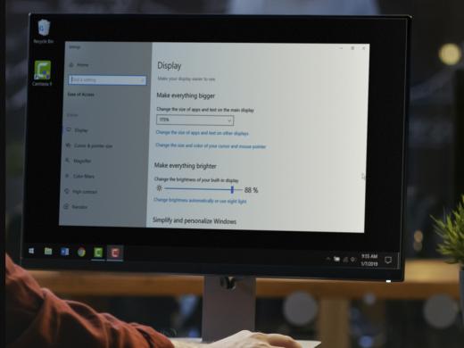
- Video · 5 minutes
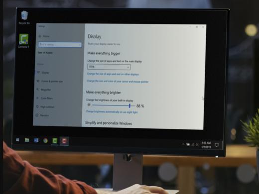
- Video · 3 minutes
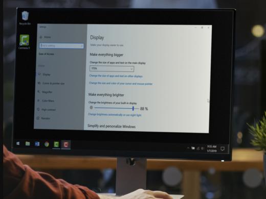
- Video · 4 minutes
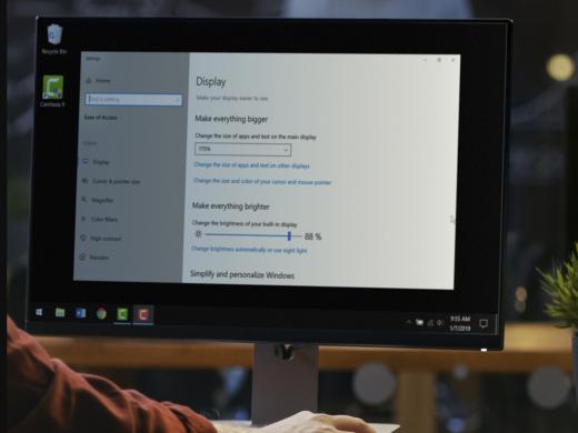
Explore
-
Coping with Vision Loss Triggers
Audio · 20 minutes
-
A family member has vision loss
Resource guide
-
6 Tips for Gardening with Low Vision
Article · 4 minutes
-
Book Nook
Discussion
- Explore more
Members also liked
- Video · 5 minutes

- Video · 9 minutes
- Video · 7 minutes
- Video · 8 minutes
Join the Hadley Community
Hadley's resources are always available to you. Create a no-cost Hadley account to go further:
-
Pick up where you left off Everything you start is automatically saved across Hadley.
-
Personalized recommendations We'll suggest resources based on your interests.
-
Join live discussions Live and lively discussions on technology, cooking, and more, all geared toward the community of people living with vision loss.
-
Find peer support Connect with people who understand what you're going through.